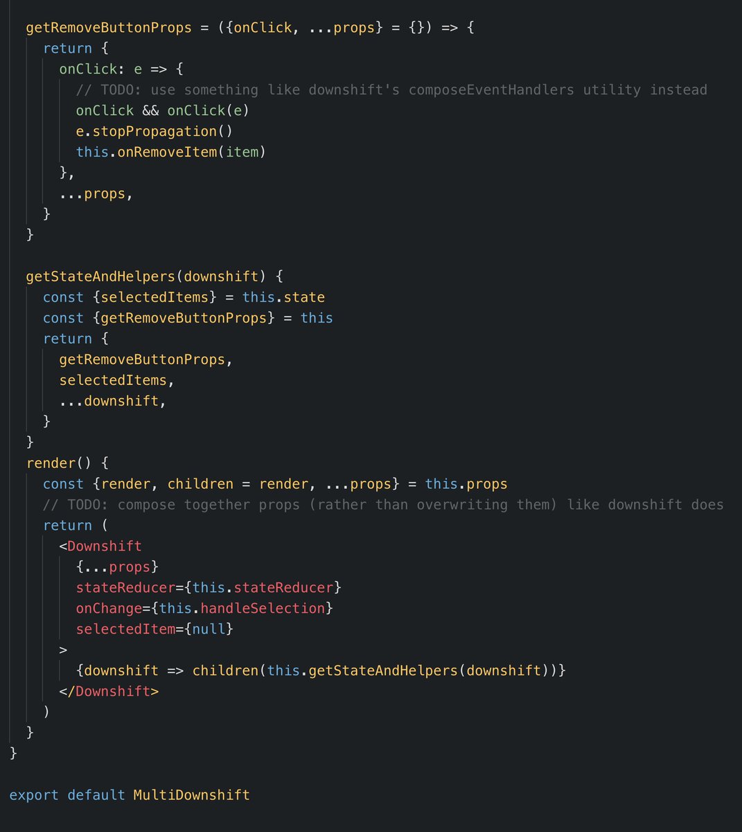
Check this out:
The example itself is a little unimpressive from a user experience standpoint (it's based on someone else's actual use-case and I didn't have a chance to update it to look pretty). But the underlying code there is what I want to talk about.
When I created downshift, I gave it the following tagline:
🏎 Primitives to build simple, flexible, WAI-ARIA compliant enhanced input React components
The key word here is "Primitives." Initially I expected that people would build cool autocomplete/dropdown packages on top of downshift and publish those to npm. I was about to write: "I have been surprised that nobody's done this." But then I checked and it turns out several libraries are in fact providing an autocomplete solution with beautiful styling and nice defaults that give a more out-of-the-box feel for downshift. I only looked briefly, but I especially love the demos from mui-downshift and evergreen-ui. Very cool!
These libraries get the point of the render prop pattern. As I said in the tweet earlier. The real power of the render prop is in its ability to be used as a building block for building other components that have useful opinions. Downshift itself makes opinions about the logic of an enhanced selection input, and then these libraries jump on top to provide opinions about what that looks like visually to the user and provide a nice API for adapting those opinions to your use cases.
My next tweet (after the one lined above) was:
This week I livestreamed myself in the process of doing this for a component I'm working on. You can find the recording here. This component is a special amount input component that has a currency selection and the input has some special behaviors (like changing the font size the wider it gets etc.). The logic behind the component is what I'm trying to share. It will have three implementations for how it will look. For now, the layout of all three implementations is:
{currencyCode}{input}
{currencyCodeSelect}
Though the layout is the same, the styles are different. Normally I'd account for those differences with CSS, but I'm confident that in the future it could have more layouts and styles. So I'm planning on having a few layers of abstraction to optimize for the flexibility (read: deletability) of the code. From top to bottom:
- Component that handles styles
- Component that handles layout
- Component that handles logic
Doing things this way gives use a lot of flexibility. At first I'll have one component at the bottom layer, one component at the layout layer, and three components at the style layer. In the future, if we need another component that behaves the same way, but is laid out differently, we can implement a new layout and style component on top of the logic component and benefit from 90% of the work that went into this initial implementation.
And that in my mind is the real benefit of this pattern. Making clear separations of functionality that a component has which enhances the flexibility, deletability, and usability of this API.
I hope this is helpful! Good luck!


